Case studies
Have a look at some successful websites, where access to information is important.
[This is not an in-depth analysis, just some things I noticed on these sites.]
A news site : BBC News
- Website : http://news.bbc.co.uk/
![[Open link in new browser window.]](../images/newwin.gif "Open external link in new browser window.")
BBC News uses quite a few graphics on its pages, which makes it fairly slow loading on a normal modem connection. Fortunately a 'Low-graphics' version ![]() is available. However, the link to this alternative version is at the bottom of the navigation bar. Links to text-only versions are better positioned at the top of a page, to save screen reader users having to work through a whole document before discovering that a more accessible version is available.
is available. However, the link to this alternative version is at the bottom of the navigation bar. Links to text-only versions are better positioned at the top of a page, to save screen reader users having to work through a whole document before discovering that a more accessible version is available.
Priority 1 Accessibility requires that all images tags contain an alternative title or description.
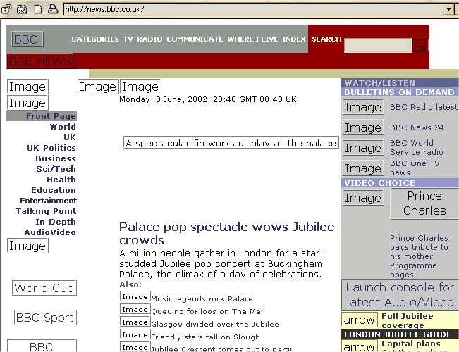
Take a look at this screenshot of the BBC News website viewed in Opera with images turned off. Alternative text is displayed, where specified.
However, this site uses spacer images (usually small invisible images used for indentation of text, in this case images of small arrows). The fact that the word 'Image' is displayed, is an indication that the ALT attribute, which should be used in image tags to add the alternative description, is not used at all here.
For purely decorative images or spacers the ALT attribute has to be included, too, but it should be left empty (alt=""). Opera will not display the image placeholder if this attribute is left empty, which would make the page less cluttered with redundant information and screen readers wouldn't be reading out Image before every line of text.
A commercial site : Amazon.co.uk
- Website : http://www.amazon.co.uk/
Amazon has developed an excellent online service based on a user-friendly and highly customizable web site. But how accessible is it?
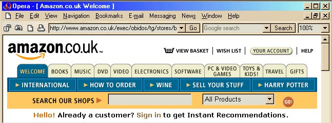
Amazon's characteristic top navigation actually consists of one big image with many clickable areas, an image map. Image maps are not always accessible. It is generally a good idea to include additional text-links, maybe at the bottom of the page, but Amazon has not done this.
Screenshot of the complex Amazon navigation bar in Opera :
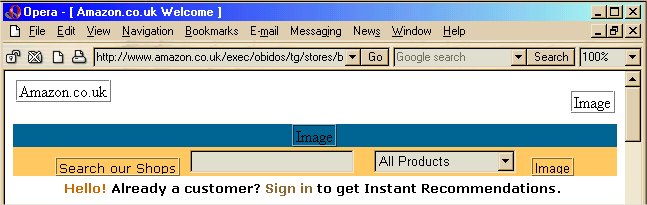
Screenshot of the Amazon navigation bar in Opera with images turned off. The navigation has completely disappeared :
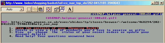
However, when we check the site in Lynx, a text-only browser, we discover that the information included by the designer in the image tags is accessible. A link, mysteriously titled [USEMAP:helpnav-general-300x22.gif], indicates that there is more information available.
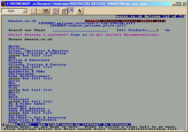
This link takes us to a list of all the links contained in that particular image: View Basket, Wishlist, Your Account and Help.
The site is accessible to any software that can interpret the properly marked-up image maps (even if they are not intelligently named), but not to a graphical browser with images turned off.
Amazon does provide a rather disappointing (because still fairly complex) text-only version of its site, but just as on the BBC site, the link to this version is tucked away at the bottom of the page. It is likely that some users of screen readers give up long before they reach this link. They will never find out that a more accessible version was available.
A search engine: Google
- Website : http://www.google.com/
Over the years Google has kept its promise to keep its interface simple, uncluttered and fast loading and to give its users just what they want and nothing else. This, amongst other things, has made it the most popular search engine. Google is accessible with any device and any browser.
Even pages deeper in the site ![]() have a refreshingly uncluttered feel to them, using graphics in an unintrusive way while adding a dash of colour to the pages. Although Google is not consistent in its layout and navigation, pages are kept so simple that this doesn't really cause a problem.
have a refreshingly uncluttered feel to them, using graphics in an unintrusive way while adding a dash of colour to the pages. Although Google is not consistent in its layout and navigation, pages are kept so simple that this doesn't really cause a problem.
Evaluation
[ Introduction ]
[ First impressions ]
[ Keyboard access ]
[ Different browsers ]
[ User control over presentation ]
[ Validation of code ]
[ Case studies ]
| Access Guide Home | Table of Contents | Definitions | Glossary |